Torre
AUSTIN, TX
Torre, a high-end student residential project from Parallel, redefined the college dorm experience. Through innovative design and meticulous attention to detail, we transformed the space into a haven of luxury and inspiration.
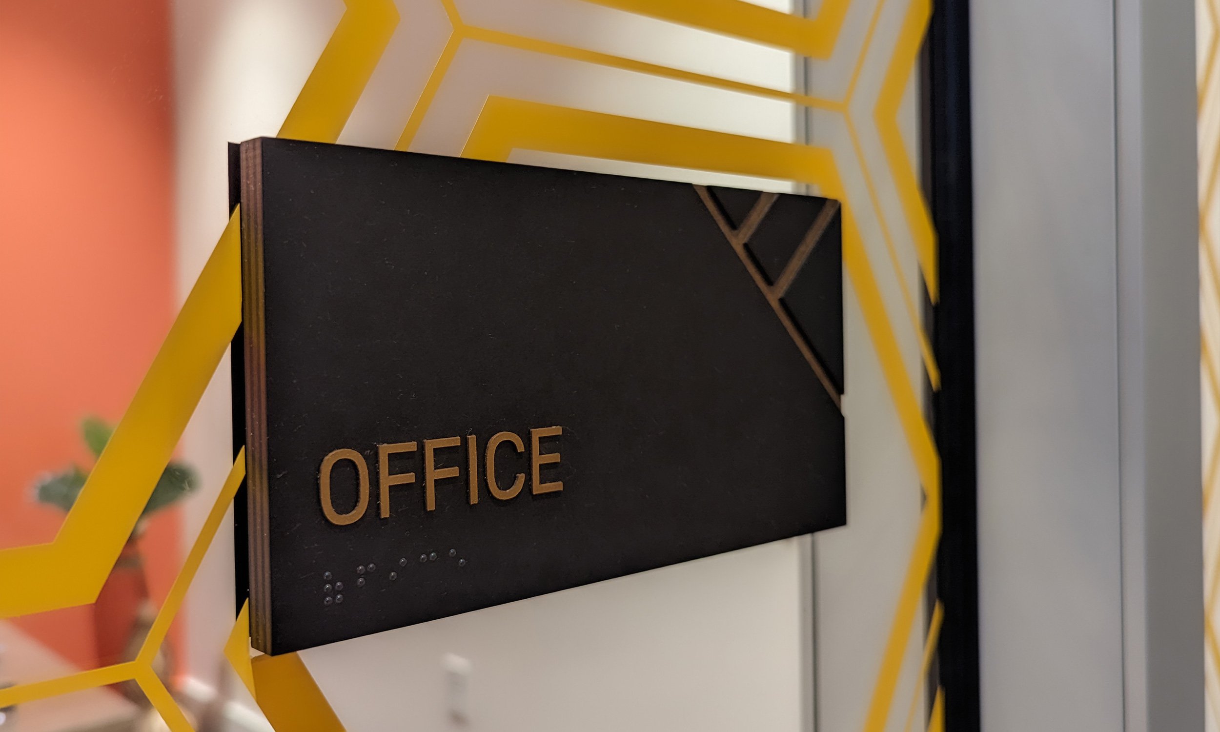
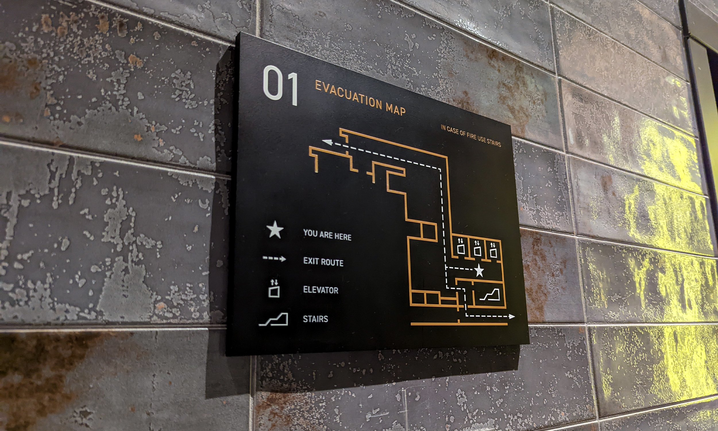
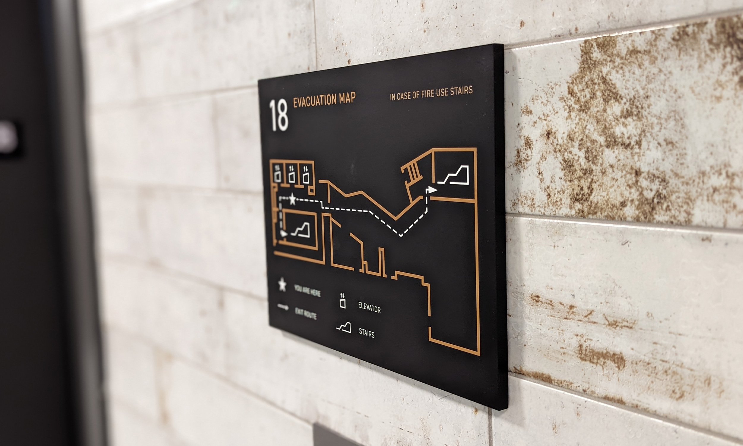
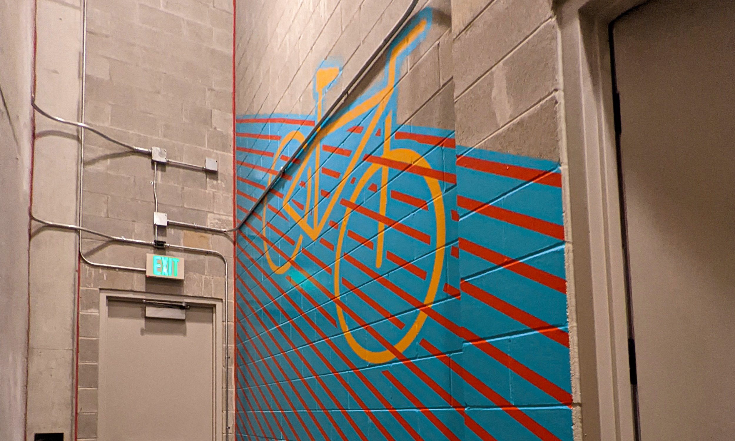
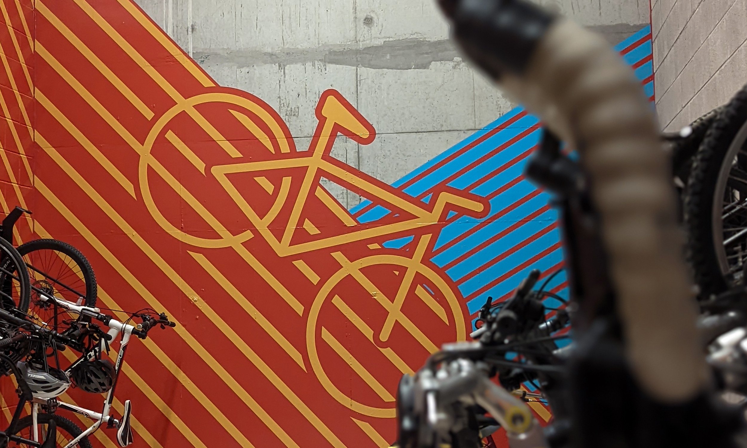
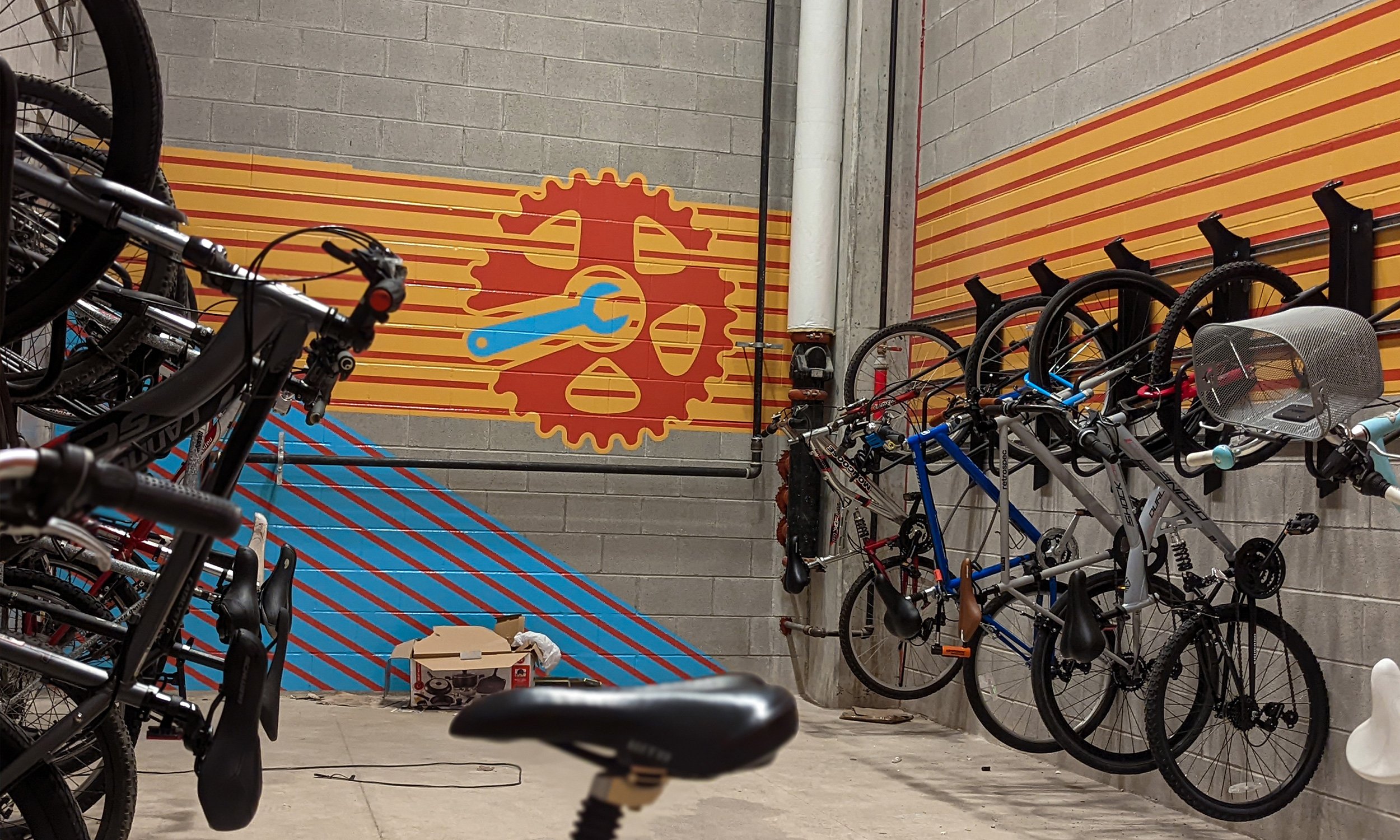
“Mexico City” was the concept Parallel tasked us take inspiration from. There were several opportunities for us to flex our design, materiality, and fabrication expertise across ADA and wayfinding signs, architectural and upgraded signage, and even wall graphics.
Our research led us to explore how we could evoke color, lighting, texture, and style through unique and unexpected materials and refined details. We designed ADA signs made with Richlite, a durable and sustainable material made from paper. We brought texture to architectural signs for a “made by hand” and aged look. We saw a smart and unexpected opportunity to integrate a lighting element into the Fuel Up bar signage.
From the first floor to the rooftop pool, Torre proves that good work comes from great partnerships.
Expertise
Building Architectural SignageInterior Architectural SignageADA SignageIntegrated WayfindingArchitectural GraphicsAWARDS
2022 TSA Design - Interior Architectural Signage