Enstor
KATY, TX
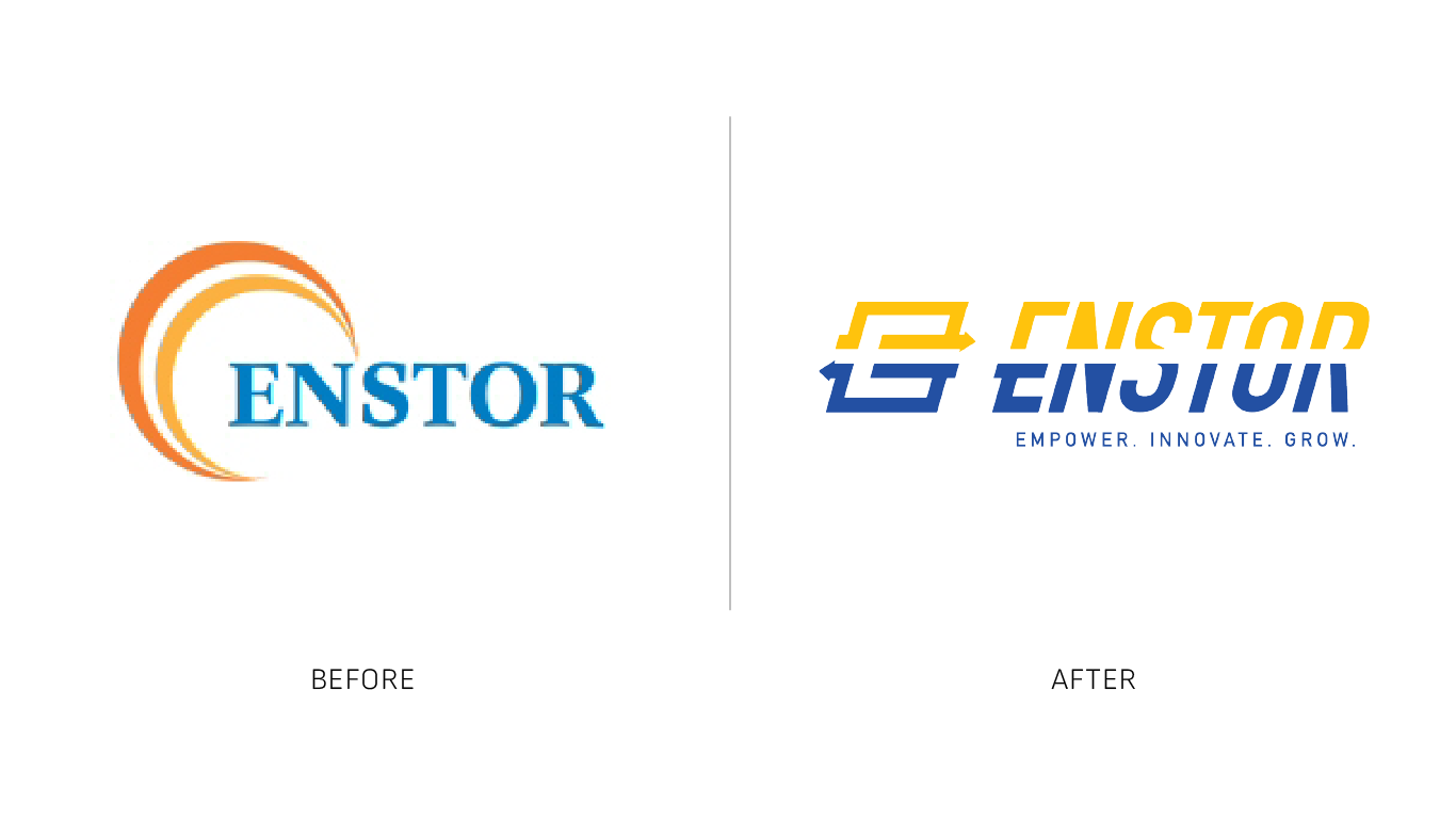
Enstor, an independent natural gas storage operator, wanted to update their brand to reflect the company’s evolution. With new sites opening strategically across the country, Enstor needed a cohesive identity—one that honored where they began while signaling the scale and momentum of where they’re headed.
-
What often goes unspoken is the depth of research behind a project like this. Before we could begin the design process, we needed to understand what Enstor was and will become. Like many outside the industry, we initially had little insight into what natural gas storage truly involves. Enstor invited us to visit a site, and after seeing and experiencing the operation firsthand, our eyes were opened. Seeing the landscape, the infrastructure, and the precision gave context to the work. That perspective allowed us to build an effective and grounded brand identity—one that reflects the process, the responsibility, and the forward movement at the core of their business.
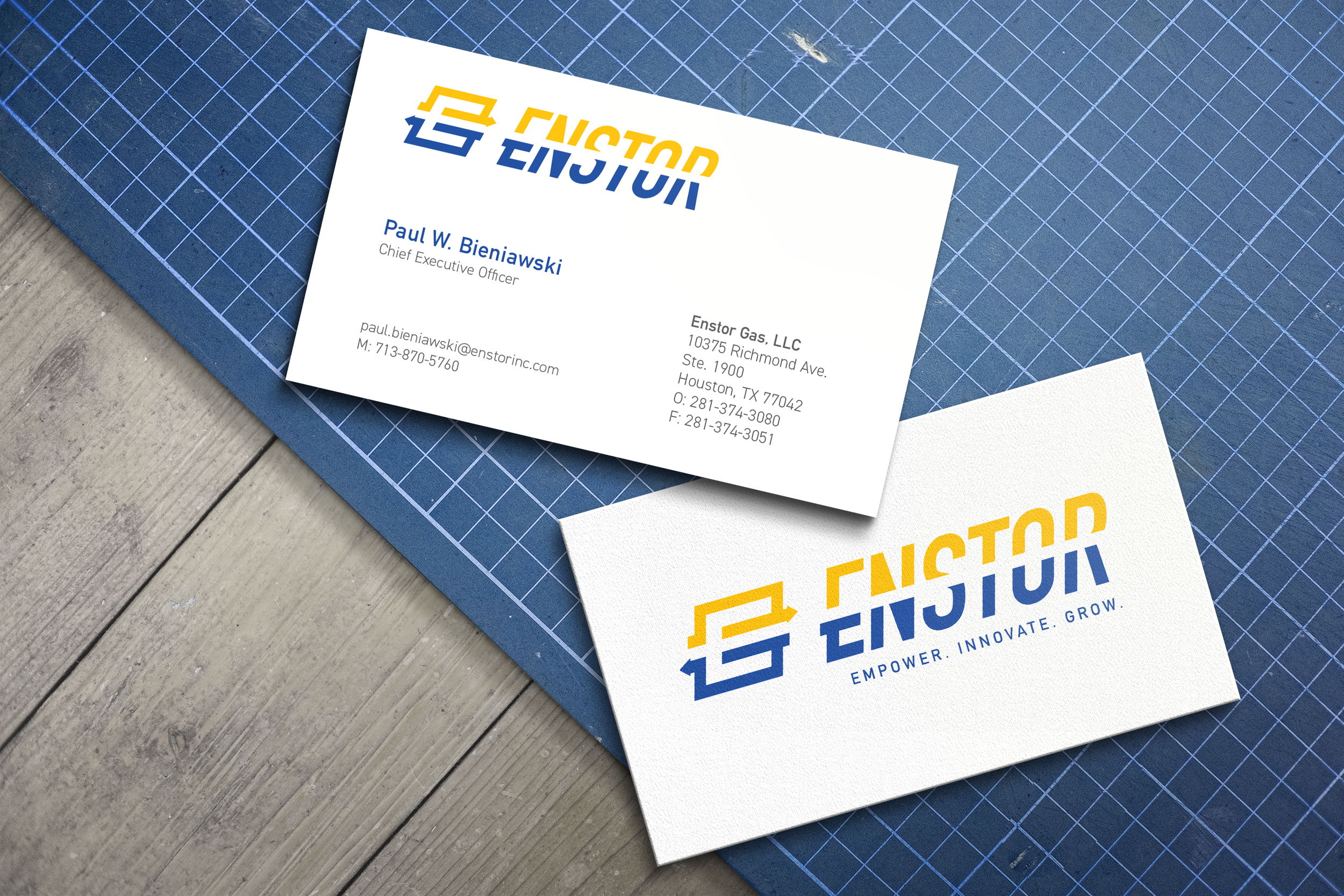
“Energy,” “innovation,” “efficiency,” and “connection” became guiding ideas for the visual language. The brand mark captures these themes through movement and form—using directional elements and intentional negative space to suggest flow and continuity—a reflection of how the company operates.
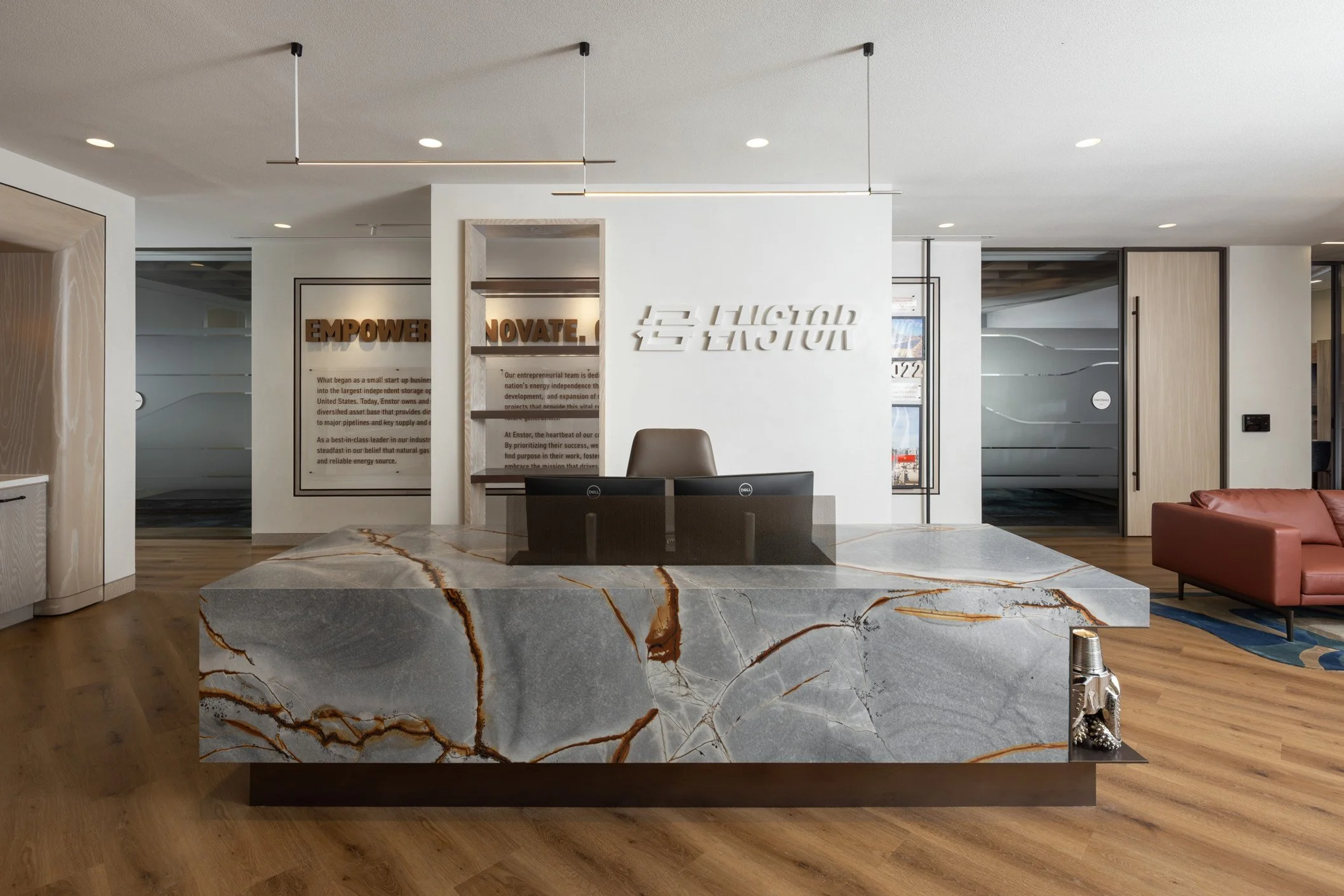
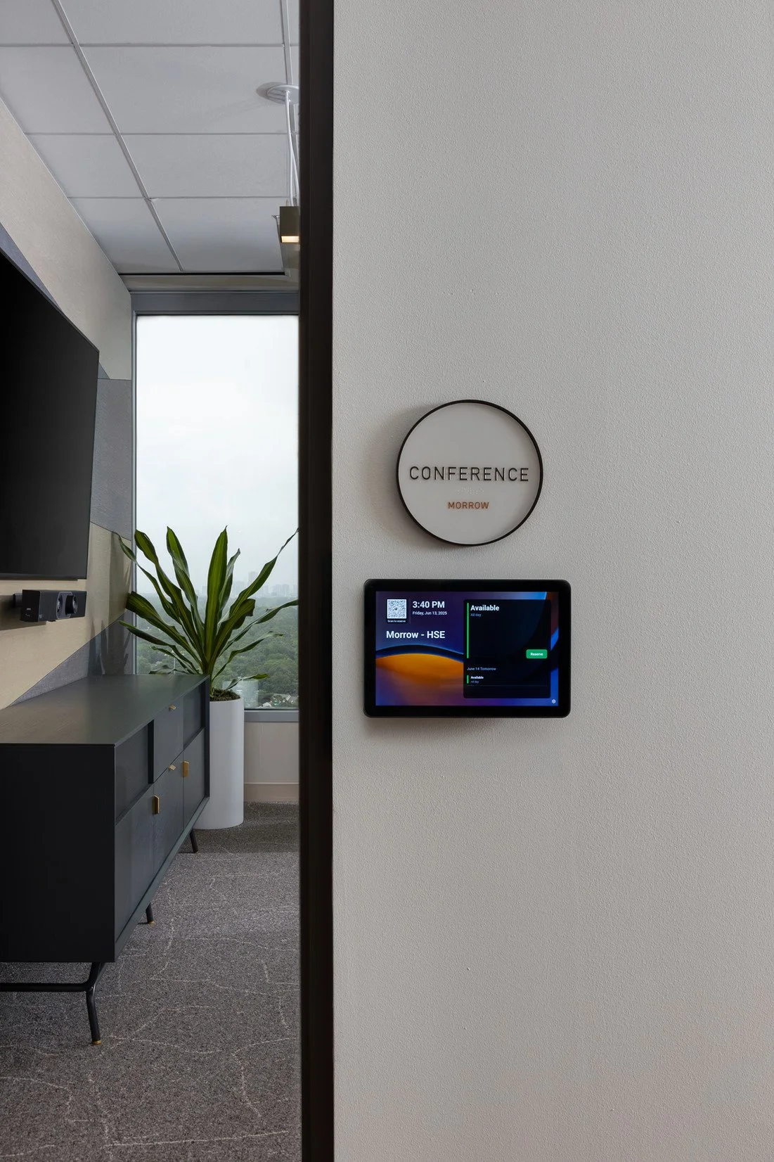
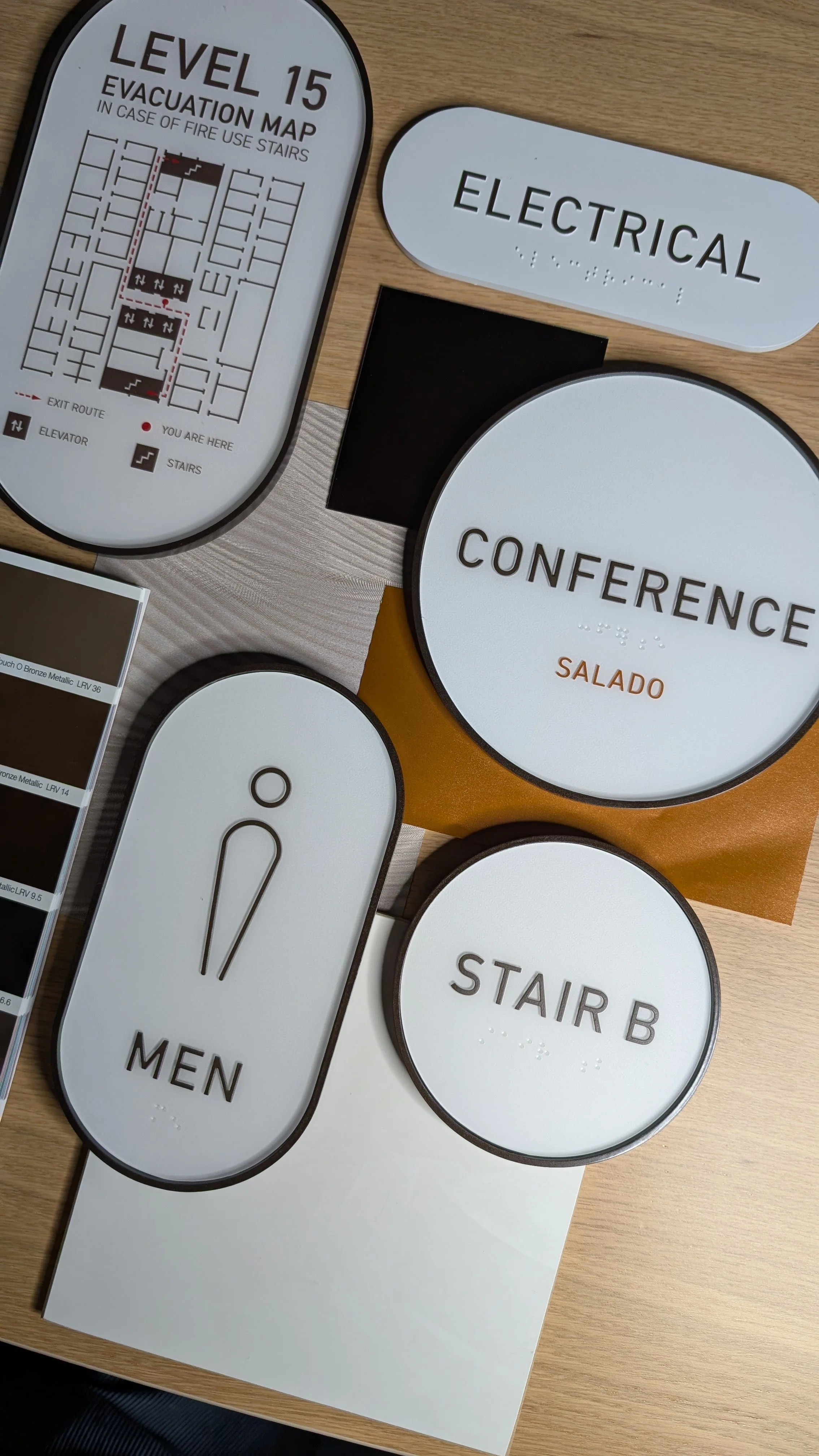
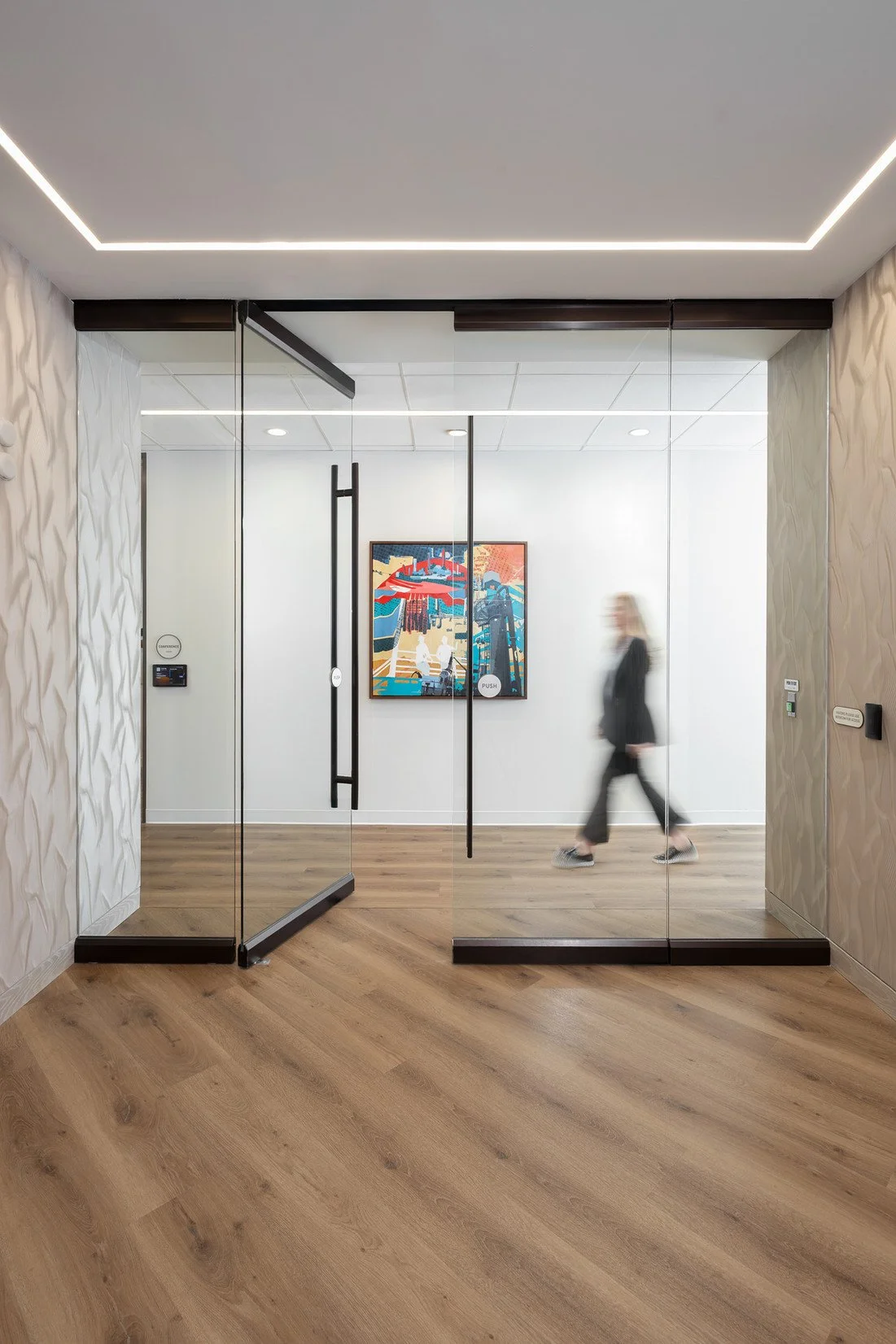
Once the updated identity was established, we took on the challenge of bringing it to space and place. In their new headquarters, we worked closely with the interior design studio Convive to ensure that their vision for the space and our vision for signage worked in harmony. In the reception area, the brand makes a quiet but confident first impression. We used custom-routed, two-inch-thick High-Density Urethane to craft dimensional letters that were applied prior to the wall being finished with plaster, integrating the sign within the architecture of the space. Bold without being loud, refined without losing presence.
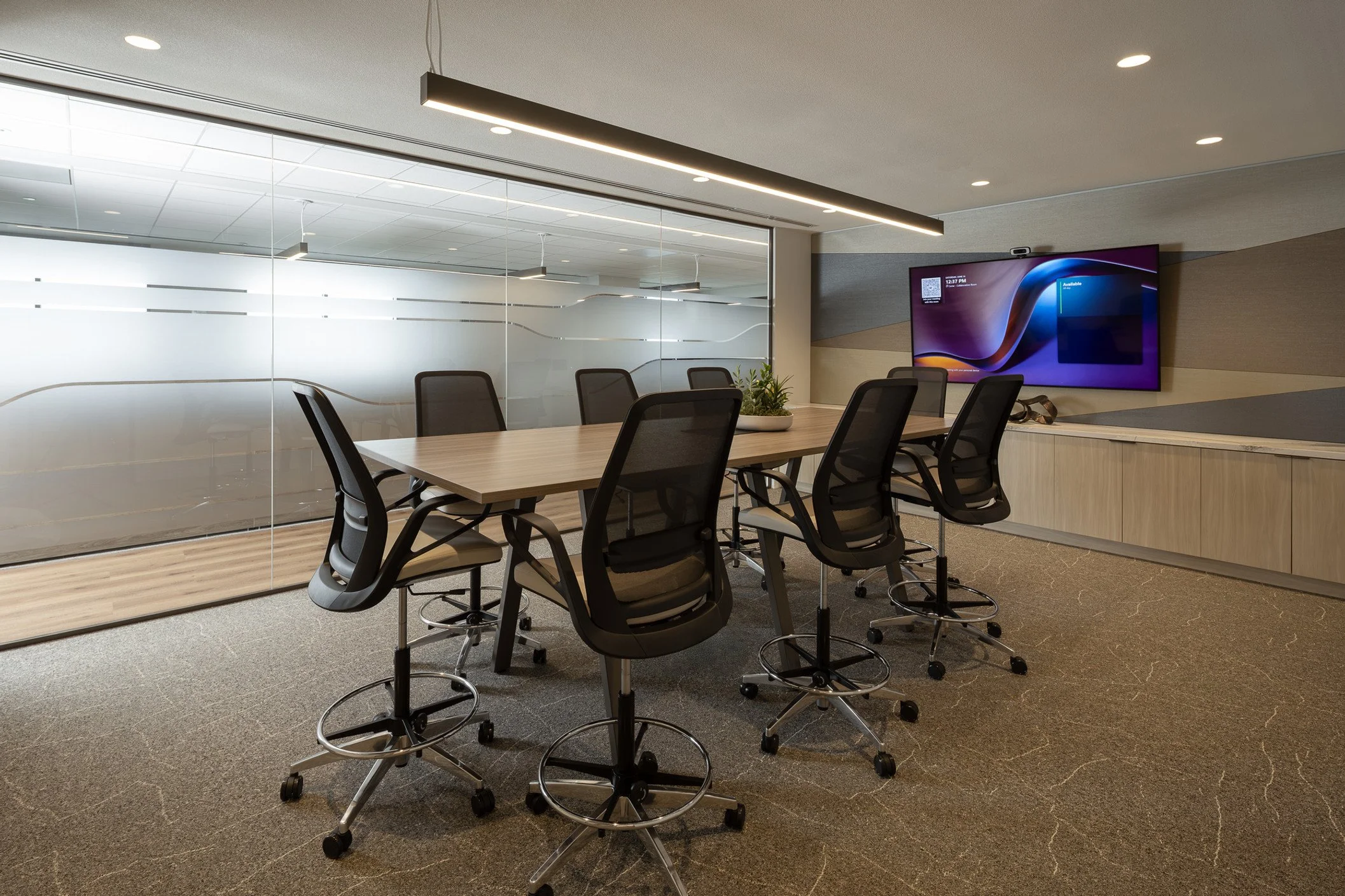
Throughout the office, subtle moments of movement echo the brand and the business. Frosted architectural graphics were designed to visually communicate the geological layers of the earth, adding energy while maintaining openness and privacy. ADA room IDs and wayfinding are clean and intuitive. Rounded shapes provide connection to the business, while color and finish reflect the refined office environment. Even individual desk markers contribute to a sense of cohesion—small details that reinforce a larger narrative.
The result is more than a refreshed logo and a new set of signs. The updated identity intentionally influenced the physical environment, allowing the brand to work as effectively in the office as it does out in the field. Every touchpoint works seamlessly to tell the same story: that Enstor is growing with intention, operating with precision, and building infrastructure that connects people and places across the country.
Expertise
Branding + Visual IdentityExterior Architectural SignageInterior Architectural SignageADA SignageIntegrated WayfindingArchitectural GraphicsStudio DZO has been my trusted partner for nearly a decade for branding strategy, graphic design, and technical signage fabrication and installation. Their work elevates the interiors beyond functionality, creating depth, continuity, and a narrative presence that allows the client’s story to unfold organically.
— Devon Bieniawski, Convive.